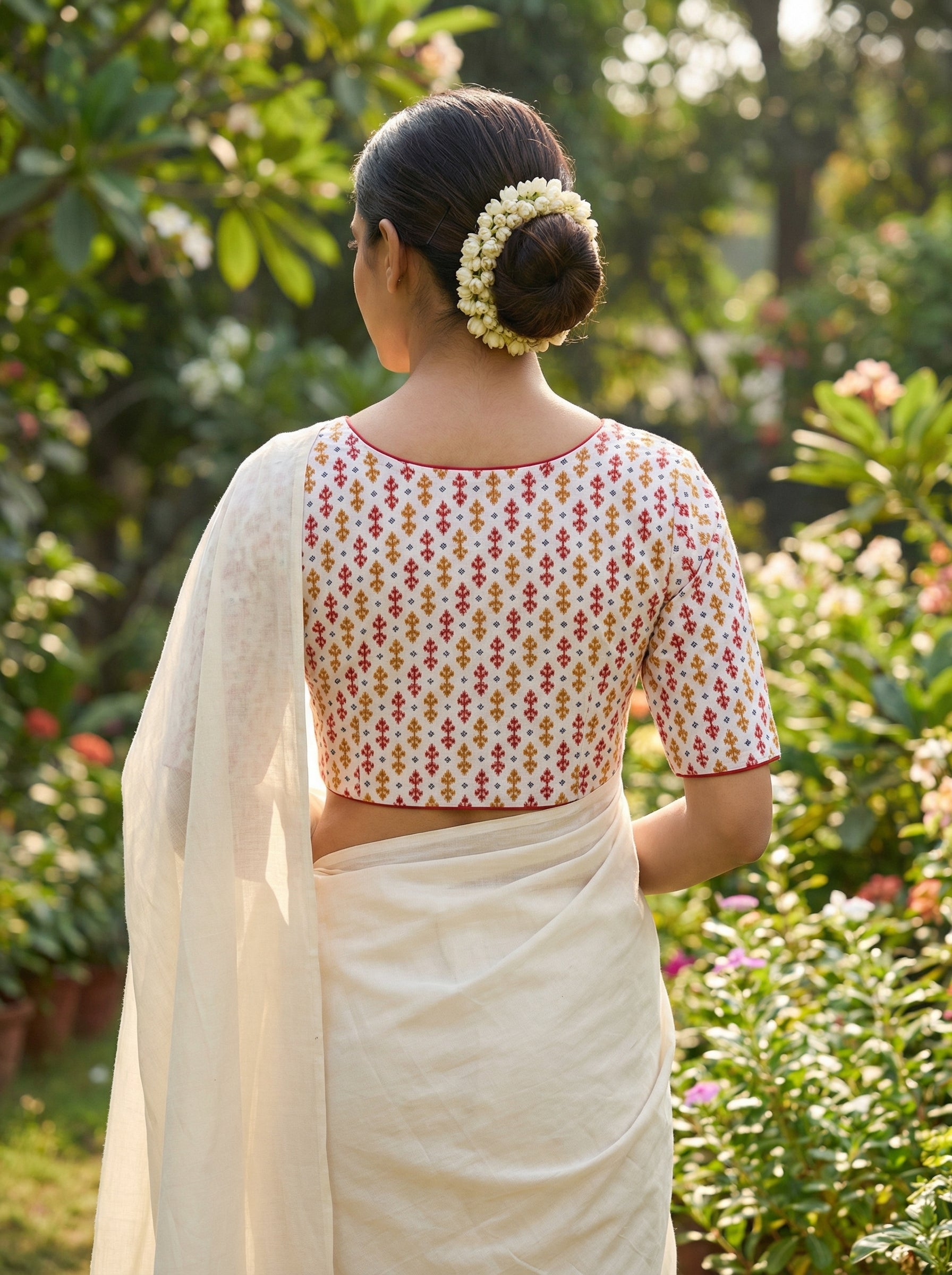
Every Indian woman has been through this situation. You have a saree you love. You want to wear it for an upcoming function. But the matching silk blouse feels too safe, and the plain white cotton blouse feels too casual, and you have been standing in front of your cupboard for twenty minutes without picking anything.
The blouse-saree colour question is the single most common styling problem in Indian wardrobes. Let us solve it.
This guide breaks colour matching into three simple approaches. Once you understand which approach fits your saree and occasion, choosing a blouse becomes fast.
The three approaches to blouse colour matching
There are essentially three ways to pair a blouse with a saree.
Matching or tonal: Blouse in the same colour family as the saree base. Very traditional. Very safe. Very forgiving. Best for religious functions, temple weddings, and situations where you want the saree to lead.
Complementary: Blouse in a colour that appears somewhere in the saree but is not the base colour. Picks up border colour, or pallu detail, or a secondary motif colour. Feels considered and put together. Best for reception nights, family functions, and most social occasions.
Contrast: Blouse in a colour that appears nowhere in the saree but sits opposite or adjacent on the colour wheel. Deliberately different. Statement-making. Best for cocktail evenings, engagement functions, festival gatherings, and when you want the outfit to have visual pop.
Each approach has its place. The most stylish women use all three, choosing based on the occasion and the saree.
When to match tonally
Tonal matching is when your blouse is a similar colour to your saree base. Slight variation is fine. Almost the same shade also works.
Best for:
Traditional temple weddings and muhurthams. Matching silk blouse from the saree pallu is expected for most South Indian and North Indian traditional weddings.
Religious ceremonies and pujas. Tonal matching signals respect for tradition.
Very formal senior family functions. Where matriarchs of the family will approve of "properly matched" outfits.
Situations where you want to look elegant without drawing attention.
Common tonal pairings that always work:
Red saree with matching red blouse (silk from pallu).
Green saree with matching green blouse.
Cream or off-white saree with cream or ivory blouse.
Pink saree with matching pink blouse.
Blue saree with matching blue blouse.
The trap to avoid: mismatched tonal. Two slightly different reds or two slightly different greens will look uncoordinated in photographs. Either match exactly, or contrast deliberately. Do not sit in between.
When to go complementary
Complementary matching means your blouse picks up a colour from somewhere in the saree, but not the base.
The saree already tells you what colours will work. Look at:
The border colour. Often the strongest secondary colour in a saree. If the border is green, a green blouse will complement.
The pallu detail. Sometimes the pallu has a different colour palette from the body. A blouse picking up pallu colours ties the whole look together.
The motif colours. Small motifs on the saree body sometimes have accent colours worth borrowing.
Complementary matching feels elegant and considered. It suggests you thought about the outfit rather than just wore whatever was in the cupboard.
Common complementary pairings:
Red saree with green border, green blouse.
Green saree with red border, red blouse.
Blue saree with gold work, cream or gold blouse.
Purple saree with silver border, grey or silver blouse.
Cream saree with red border and gold zari, red blouse.
Multi-colour saree, pick the most prominent secondary colour for the blouse.
When to go contrast
Contrast is the boldest approach. Your blouse colour appears nowhere in the saree. It sits opposite on the colour wheel or in a completely different colour family.
Best for:
Reception nights and cocktail functions where you want the outfit to be memorable.
Engagement functions and sangeet events where a slightly modern look is appropriate.
Festival gatherings where you want to stand out warmly.
Photography and family portraits where contrast reads dramatically in images.
Younger women at family functions where slight modernity is appreciated.
Contrast pairings that photograph particularly well:
Red saree with royal blue blouse. Classic Bengali bride combination.
Green saree with mustard or ochre blouse. Warm-cool balance.
Yellow saree with dark green or maroon blouse. Traditional Indian jewel-tone combination.
Purple saree with olive green or mustard blouse. Modern and sophisticated.
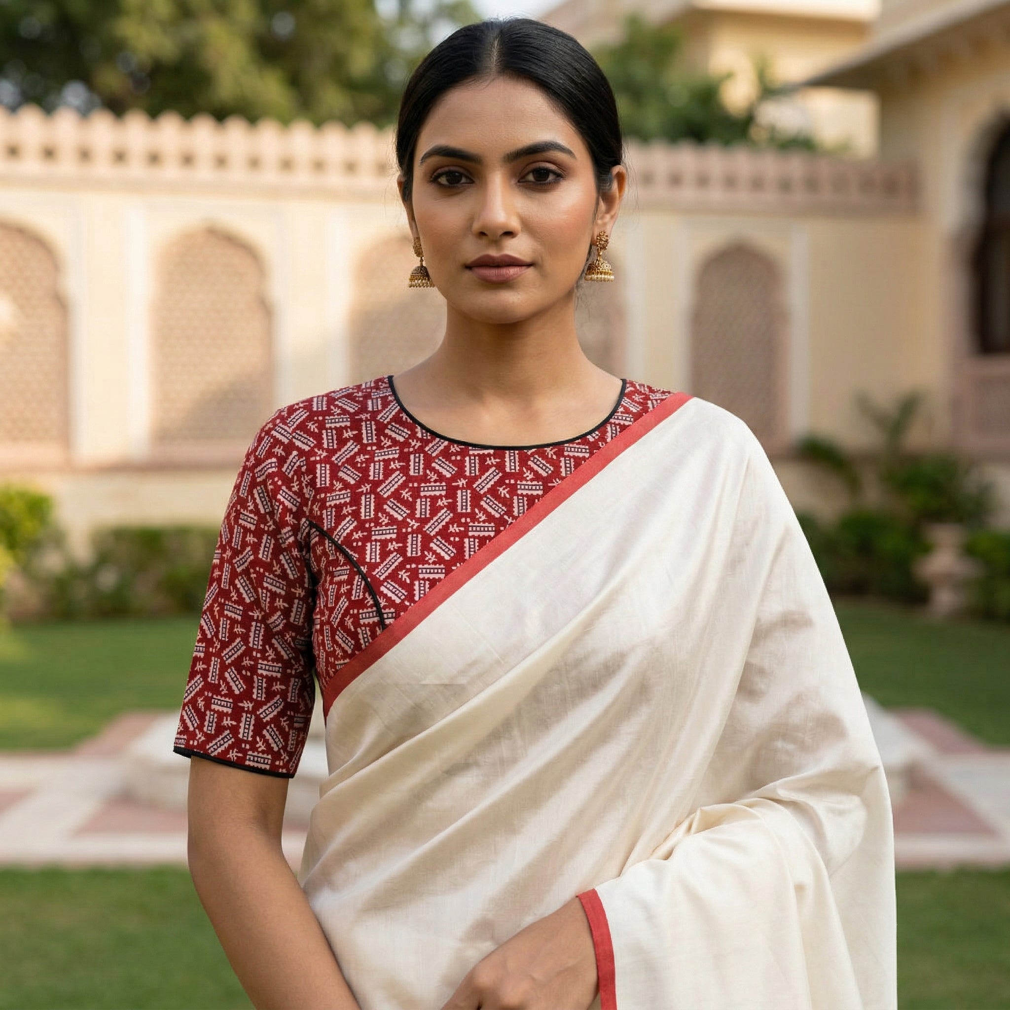
Cream saree with indigo Ajrakh blouse. Understated but striking.
Black saree with emerald green or magenta blouse. Bold for evening functions.
Pink saree with bottle green blouse. Traditional and safe.
The colour wheel, quickly explained
If you have never thought about a colour wheel, here is the fastest possible summary.
Colours sit in a circle. Directly opposite each other are complements (red opposite green, blue opposite orange, purple opposite yellow). Next to each other are analogous colours (red, orange, yellow) that share warm or cool undertones.
Contrast pairings use opposite colours. Analogous pairings feel harmonious but softer.
For sarees, you can think of it this way:
Warm sarees (red, orange, yellow, coral) pair well with cool blouses (blue, green, purple).
Cool sarees (blue, green, purple, mint) pair well with warm blouses (red, orange, yellow, mustard).
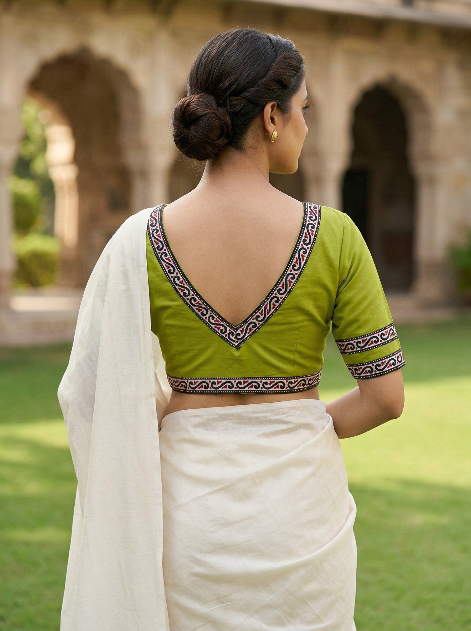
Neutral sarees (cream, off-white, beige, grey, black) pair well with anything.
This is why cream sarees and blouse pairing feels easy, and why very colourful sarees can feel tricky.
Considering the occasion
The formality of the occasion should influence which approach you use.
Very formal traditional occasions (temple weddings, religious ceremonies, senior family functions): tonal matching, matching silk blouse if possible.
Semi-formal traditional occasions (wedding receptions, engagement functions, festival gatherings): complementary matching, cotton contrast blouse acceptable.
Modern and semi-formal occasions (sangeet, cocktail nights, office festival days, corporate events with saree code): contrast matching, cotton blouses fully welcome.
Everyday and semi-casual (family lunches, temple visits not tied to specific rituals, day festivals): any approach works, comfort matters most.
Considering the fabric
Cotton contrast blouses work best when the saree has some silk or shine. The visual contrast of cotton matte and silk sheen adds dimension.
Silk blouses match better when the saree is also silk. Silk on silk feels formal and traditional.
Handloom cotton blouses match well with handloom cotton sarees, semi-silks, and lightweight silks. They can feel slightly out of place with very heavy Kanjivarams or Banarasis.
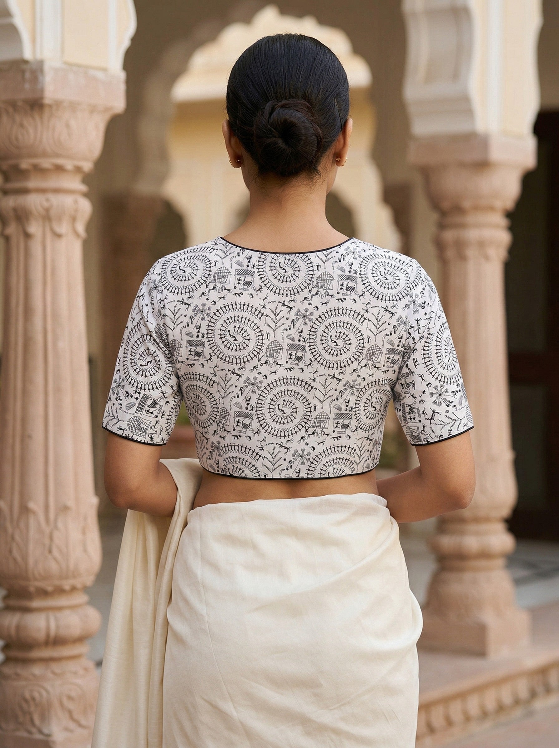
Embroidered or block printed cotton blouses have enough visual weight to hold their own with silk sarees. Plain cotton blouses can feel understated.
Considering your skin tone
Colours affect how you look, not just how the saree looks. Some quick pointers:
Fair skin tones: Most colours work. Pastel and cool tones are especially flattering. Warm mustards and coppers also look great.
Medium skin tones: Rich jewel tones look best. Emerald, ruby, sapphire, deep purple all photograph beautifully.
Warmer medium skin tones: Warm colours like coral, mustard, and terracotta suit particularly well.
Darker skin tones: Rich saturated colours like royal blue, emerald, mustard, and hot pink look wonderful. Very pale pastels sometimes wash out.
If unsure, try the fabric against your face in natural light before buying. Colours that make your skin look tired or dull are not for you, regardless of how nice they look on the hanger.
A practical exercise
Take three sarees from your cupboard. For each one, ask yourself:
What is the base colour?
What is the border colour?
What secondary colours appear in the pallu or motifs?
What occasion do I wear this saree for most often?
For a traditional occasion, plan a tonal or complementary blouse. For a semi-formal or modern occasion, plan a complementary or contrast blouse. Write down two or three specific blouse colours for each saree.
This exercise gives you a mini styling plan for your existing wardrobe, which is much more useful than random buying.
About Sayani's Creation
We make cotton contrast blouses that work for most sarees in the Indian wardrobe. Our current range includes solid colours in cream, red, green, blue, black, mustard, and pink. Print and embroidery ranges include Ajrakh, Madhubani, kantha, and hand block print styles.
Sizes 30 to 44 available across all designs. Detailed measurements on every product page. Custom sizing available.
Pan India delivery in four to five working days for most cities. Cash on delivery across most states.
Featured Product in this Article
 View
View
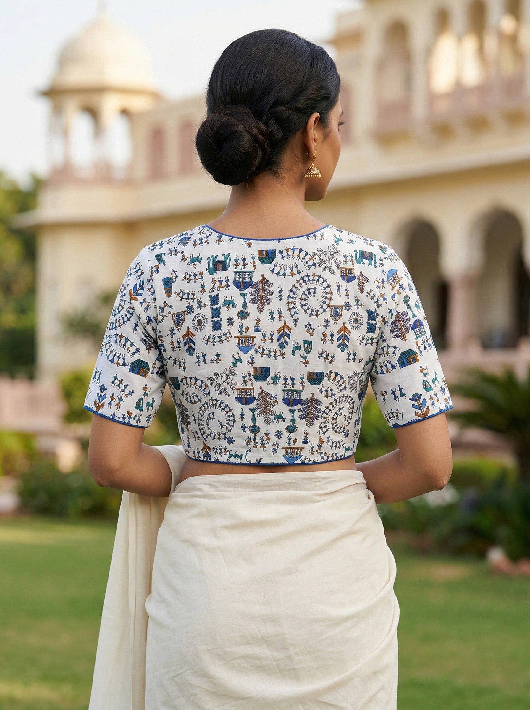
White & Blue Madhubani Hand Printed Cotton Saree Blouse (Size 30–42)
Frequently asked questions
Should I always match my blouse to my saree colour?
No. Tonal matching is one of three valid approaches. Complementary and contrast pairings can look equally or more stylish depending on the occasion.
How do I know if a contrast pair will work?
Look at Indian traditional colour combinations. Red and blue, green and yellow, purple and gold. These have been used together for centuries and always work. Modern combinations like mint and coral, or dusty pink and olive, take slightly more thought but can look beautiful.
Can I wear a plain blouse with a plain saree?
Yes, but add some visual interest through the blouse design, embroidery, or back neckline. Plain-plain can look understated to the point of blandness.
What if I am not sure which colour to buy?
Buy cream first. A well-cut cream cotton blouse with fine embroidery works with almost any saree in most Indian wardrobes. Then buy your second blouse based on what you actually wear.
Do you offer colour matching help before purchase?
Yes, our customer support on WhatsApp can help suggest blouse colours if you send us pictures of your sarees. This is a free service for our regular customers.